


Tue
20
Jul
2021
Break in Case of Silence
On book cover design, dark drawings, and The Common Breath's Brian Hamill

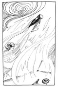
When fireflies dance from the open wound of your mouth. When you have talked graves free of their bones, dug wasps from their homes. Stung truth with a raw tooth. When grief has bitten your hand for feeding it the names of the lost. When you have found a secret garden within the reckless brambles of your heart, where the silence deepens until trees wail by comparison.
– excerpt from ‘Break in Case of Silence’, by Zachary Kluckman
As a designer of book covers, there are many key moments during the process, starting from the first email offering a commission, to the point when you have the finished book in your hand. That
moment when the courier drops off the heavy cardboard box, the parcel tape is slit through, the crumpled paper stuffing is bundled aside and then – there are the books. And there is your front
cover staring up at you in rows of fours and sixes. That moment is a blend of excitement and terror; what if something has gone wrong between finally letting go of the design, and hitting ‘send’
– and the printer at the presses hitting ‘print’?
What if there’s a rogue overprint in there? What if I’ve fumbled my keyboard at the last moment and inserted a typo? Thankfully – usually (but not always) – the book cover will print pretty much
as I would have hoped.
Any designer will confirm that what you see on your screen is often quite far removed from what appears on the book when that printed copy finally arrives. I’ve always had a tendency to go dark
with my artwork, it’s just always been my thing: moody, shadowy, detail obscured in gloom. In publishing though, that can present problems, especially for book covers. I would hope, though, that
the publisher who trusts me to front up their book knows what to expect of me. When I’m given the freedom to create, I will tend towards the darker end of the spectrum.
I’ve been fortunate enough in the past few years to have been asked by the Association for Scottish Literary Studies (ASLS) to design covers for their annual New Writing Scotland collection, which is always a joy to work on. Duncan Jones and the editors will provide a
poem which has inspired the title of that year’s collection, and I’m then given the choice either to use it directly as inspiration or to do completely my own thing. For an artist that’s a real
gift, as you can’t really ask for more space for freedom of expression than that. So, on reading the poem ‘Break in Case of Silence’, by Zachary Kluckman, which centres on death and grief, I
found myself inspired straight away. I often find that the final piece of art I produce for a cover will not have deviated too far from my first thumbnail sketch. Again, this was the case,
although maybe that says more about my lack of flexibility than my driven sense of purpose. By a weird serendipity the very morning of the day I was commissioned by ASLS, I woke to find a young
rabbit laying on its side, dead, on my kitchen floor. A lovely wee thing, its head was slightly bloodied. Cursing my cat (for he it was who was responsible), I stopped to photograph the rabbit
for some kind of odd posterity – little realising that I would be incorporating it into a book cover before long. Also coincidentally, the imagery of nature that Kluckman had used in his poem was
already in my head. For some weeks I had been at work on my second children’s picture book, which is a story about gardening, nature, growing your own veg and occasionally letting things stay a
little wild. My head was full of nettles and brambles. For this cover I saw a night scene: a rabbit lying dead in long grass, under a thicket of thorns. There’s a sprig of forget-me-not. And a
tiny prick of light reflected in its eye from the hidden glow of a firefly behind a leaf. I had been out in my garden the night before, snapping some pics of a string of lights which was
gradually becoming smothered in bindweed. Again, this felt like some kind of mirroring of the fireflies in the poem.
More than these surface similarities, though, the theme of grief and death had struck a chord with me. That spring in Glasgow, the publishing community was in a state of sadness over the
disappearance of Brian Hamill, publisher and creator of The Common Breath. Brian had been missing
for two weeks, amid reports of a young man seen (in the blandest code) ‘entering the river Clyde’. Our fears were realised when at length a body was recovered from the water. Expressions of grief
and shock began to appear on social media from his fellow professionals, followed by tributes to Brian’s personality, hard work and passion for the written word. His desire had been to rediscover
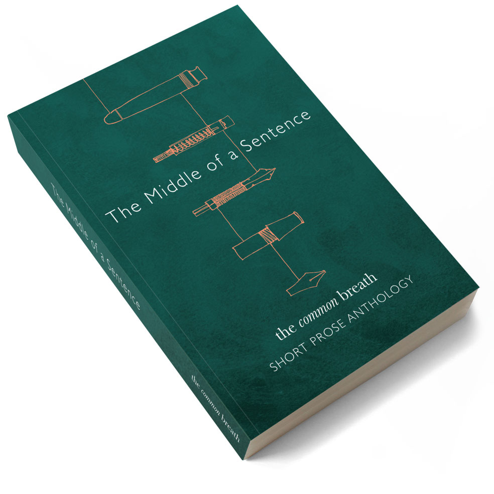
forgotten or obscure writers and give them a fresh lease of life, and in parallel to give the many talented but unheard voices in poetry and prose a forum to be read. His 2020 collection The
Middle of a Sentence was received by the contributors and readers with such enthusiasm that it felt almost like an awkward omission that there were not already more such opportunities for
new voices to be heard. It took a young man in his spare time, using his passion and dedication to the written word, to bring together the new and unpolished with some more weel-kent names, into
a single book. At the time of its publication Brian was overwhelmed with requests for copies and went swiftly to reprint.
I’d had the good fortune to be invited to create covers for The Common Breath since its first publication Good Listeners, co-authored by Brian and Alan Warner. I had met Brian in person only once, years before, at a book launch for Vagabond Voices. In all the intervening time he had kept me in mind as a cover designer and with The Common Breath up and running he was finally in a position where he could commission me. Up to and throughout the period of lockdown we collaborated on a further four covers. He was generous to me with his praise, encouragement and ideas, as I’m sure he was to his written-word contributors. He was humble in his requests for changes or artistic suggestions, and self-deprecating almost to a fault. I found that he would judge his own contributions harshly which, in retrospect, makes me a little sad that he perhaps didn’t realise just how appreciated he was. Our communication was such that I counted him as more than just a colleague. Indeed, his typical sign-off was ‘my friend’ and I had been looking forward to getting together again, post-lockdown, when we could have met up in person in Glasgow for a cup of tea and a proper blether. I know that we’d have got along famously. What a legacy he has left behind — not just the handful of wonderful titles TCB has published, but a genuine void in a community, and grief in a widely scattered group of creatives. Plus an underlining of the fact that there is a real desire for further forums where unheard, uncovered or forgotten voices can be read – or read again.
In reading the tributes of the publishing community, I recognised the same traits in their relationships with Brian as in mine: ‘I got to know him via email during lockdown’ … ‘I was really
looking forward to meeting up’ … ‘I felt that he was my friend’ … ‘I had no idea what he had been feeling’. It had got so close to that point of being able to meet up, when the news came through
about Brian’s disappearance. It was a profound shock, and I couldn’t wrap my head around it. I had no knowledge of his real life situation, or about what may have been weighing him down. Nor was
it for me to speculate. It’s unfortunate that concerning suicide, a common reaction from colleagues and friends is: ‘I had no idea.’

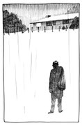
2020 had been a busy time for The Common Breath and in January I had just completed the cover for All to Blazes by New Zealander Frank Sargeson – a collection by another under-appreciated voice in literature. Brian and I had arrived at an image of a New Zealand ‘bach’ – or beach hut – still inhabited but with an air of abandonment and solitude; bound at the rear by trees and to the foreground by a sea of dry grasses. In many ways I felt a familiar muscle memory of this drawing as I created the artwork for Break in Case of Silence. It felt like a sombre echo of that earlier illustration: of loneliness, darkness and the passing away of a life. I worried a little not only about the physical gloominess of the drawing, but the darkness of the imagery itself. In creating it, I realised that I wanted this to be a kind of personal tribute to my friend, but I had also to remain true to the commission. ASLS were as generous as always, and enthusiastic for the cover despite my misgivings of details that might be lost under a matte laminate. I think too that Brian would have reacted favourably to it and said kind things, as, more often than not, he did. If not quite dedicated to him, this artwork was done in his memory. I hope that is fitting – ASLS and The Common Breath both share that common purpose or bringing new talent into the light.
Break in Case of Silence Editors: Rachelle Atalla, Marjorie Lotfi and Maggie Rabatski (Gaelic). Published July 26th 2021, avialable to pre-order here.
Please donate to the GoFundMe in honour of Brian Hamill, to buy a memorial bench, raise money for men's health charities, and to support The Common Breath.
Tue
01
Oct
2019
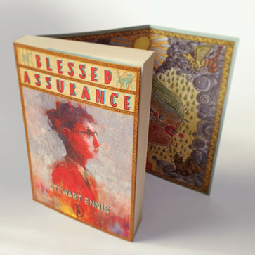
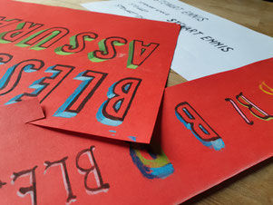
Designing Blessed Assurance
Maybe it's appropriate that this was the book that taught me to draw with my left hand – my 'wrong' hand. It’s said that you either use one side of your brain or the other when it comes to drawing, and I'm pretty sure this cover proved that point to me. For a designer it's really important not to close off too many creative avenues at the start of a project, and while I try my best to use traditional techniques in most of my covers, there's no denying the life-saving advantages of the final digital stages. In this case, it came to an actual reversal...
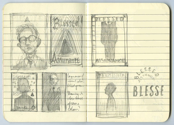
Joseph Kirkland's map of Kilhaugh lies at the centre of Blessed Assurance, and the biggest challenge in this commission was to create that map in the authentic style of an 11-year-old child. I became a reluctant faux-naïf. Whether or not I succeeded, I'm undecided. Picasso famously said that it took him four years to learn to paint like Raphael, but a lifetime to paint like a child. It's certainly not an easy thing to fake (in fact I almost asked my own kid to draw it for me. The trouble is he was the wrong age – and too good at drawing anyway).
I met up with the book's author Stewart Ennis for a chat and a pint in Glasgow's West End one sunny evening in the Spring of 2019. I had just finished reading the penultimate draft of Blessed Assurance and I was bursting to discuss the characters and themes of the novel with its author. Stewart told me I was first person to have read the draft and he was pleased that I liked it so much. He had the giddiness of a soon-to-be-published author that says I'll be happy no matter what is on the cover. However, he did have some thoughts about what form the front of his book should take. He mentioned the artist Joan Eardley, and specifically her vibrant studies of Glasgow children. Stewart's characters are Scottish kids from a spectrum of backgrounds, and he saw Eardley's characterful style as a perfect fit. On the other hand I had William Blake in my head, for his queasy religiosity. The novel is earthy and grounded but with a spiritual aura around it. Joseph himself has an mystical undercurrent in him that occasionally comes to the surface. His inner struggle to come to terms with his family's religious expectations and his own inner demons was what I had to try somehow to get across.
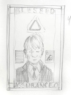
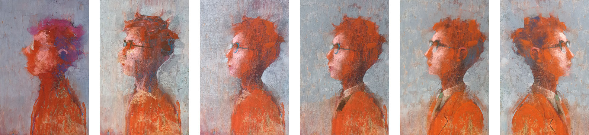
I always saw a portrait of Joseph as central to the cover. It should be formal, carefully arranged, decorative; perhaps like a bookplate in one of those old books gifted to a youngster for perfect attendance at their Sunday School. Or he should be depicted surrounded by stars, or the rays of the sun, or some kind of religious symbolism. I began poring over images of Blake's watercolours and trying to absorb his style but I quickly reminded myself that it's one thing trying to ape someone's style, but a different matter to borrow their sensibility. I'm quite eclectic in terms of drawing but it's usually safer to stick with a style and technique that's my own. So, I decided to get my fingers dirty with a flickery, colourful pastel drawing.
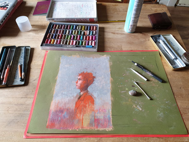
The portrait took two or three days to complete. As is usually the case with a drawing, the first attempts were poor and frustrating. What you see in your head stubbornly refuses to appear on the page. When that happens it's best to leave it alone for a day, and move on to something else. So, returning to this scraggy pastel eventually, I tried to be simultaneously bold and looser and also to be more precise in the actual drawing of the details. What did Joseph look like anyway? Stewart told me he pictured him with a dark crop of hair – kind of curly perhaps. Again, a description vague enough to leave me with room for artistic license. I wanted his expression to be blank, but not vacant. It had to suggest his openness, with a slightly uplifted face. Looking to God? His glasses obscuring his eyes.
The artwork gradually took shape, and finally, in placing the image into the design itself dawned the realisation that maybe I had drawn him the wrong way around. In a notoriously dangerous move I flipped the image. (This, as any art teacher will tell you, is how an artist reveals the flaws in his or her drawing. Look at it in the mirror and the disastrous lopsidedness or skewed proportions miraculously and disappointingly reveal themselves.) As it turned out I hadn't accidentally taken on Picasso's cubist style, and mirror-image Joseph looked relatively correct. So then I tried him small, large, centred, to the left, to the right. Too many choices make themselves available to you when you go digital. In the end, I had him facing 'outwards' to the right, centred and large. He had to be dominant.
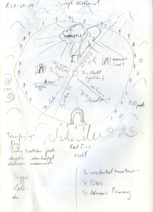
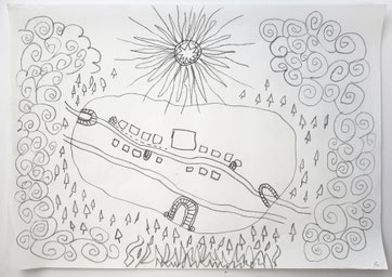
That Joseph ended up surrounded by a dense grey fog instead, with all the colour inside him struggling to get out, is due to the map. Joseph's Kilhaugh Mappa Mundi sucked all that colour and symbolism into itself, and took its place on the inside covers. Stewart had been determined to have his first novel feature a map of some kind at the front (because "all the best books have maps at the front"). In his pages the description of the map was detailed enough to help me populate the drawing but also vague enough to give me the headache of not really knowing where everything laid in relation to everything else. Which was probably ok because in a way that suited the naïve style of the map. I went through multiple drafts, trying to achieve that childlike style. My daughter suggested I draw with my left hand instead, which opened up a new definition of painful awkwardness for me. I'm aware that wrong-handedness is an art exercise but it's not one I'd choose to repeat very often. It was stressful – I could actually feel my brain resisting my hand. In the end I didn't really use the lefty drawings, they were just too rough. But the map was completed at last, then coloured in with scribbly coloured pencils, and decorated with monsters and mermaids around the edges. I figured that for these, Joseph would have referred to his old books & maps and found some original drawings that he could copy quite closely, so they would appear to be drawn in a more sophisticated style. The fog that cloaks the town during the passage of the novel is there too, pressing up against the village boundaries and hiding all the lurking terrors of the outside world – including the many gates to Hell that Joseph has been warned to avoid.
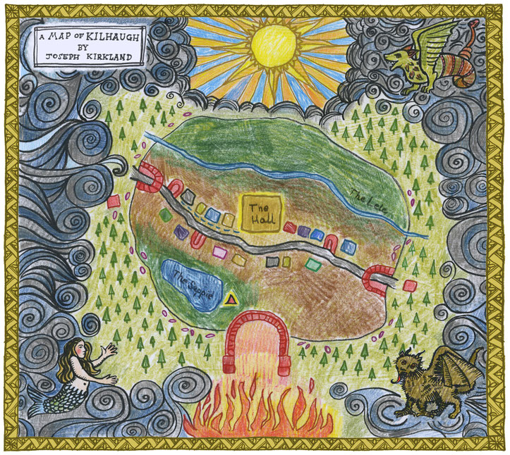
To extend the homespun feel of the cover I decided to create some hand-drawn typography. While it's one thing to try to remain old-school for technique, I needed the flexibility of digital editability with my titling. So I drew up my lettering on pastel again, with a faux three-dimensional aspect, scanned it, then began to compose them, settling on a framed arrangement, top and bottom on the page. A slender border around the portrait and a further border around the very edge the cover takes on a formal aspect which wasn't too far away from the religious iconography that I'd had in my head originally. The final elements were a pair of illuminations for the title: Grandpa's budgie in its cage, and the tinker's dog, looking almost wolf-like, caged by the woods. I tried to show them in a 'rampant' aspect, in the style of a medieval woodcut. It struck me that they formed a kind of symbolic symmetry that just fitted the themes of Blessed Assurance.
Blessed Assurance can be bought from high street bookshops, Wordery.com or the publisher's website: Vagabond Voices
Thu
11
Oct
2018
Designing Three Kinds of Kissing
When I'm asked by a publisher to design a cover for another person's novel, I'm taking on a responsibility – that author's creation is being put into my hands. For a new novel, the cover becomes the book's calling card, its face. So whatever I create as that face has to be true to the tone, the flavour, the heart of that story.
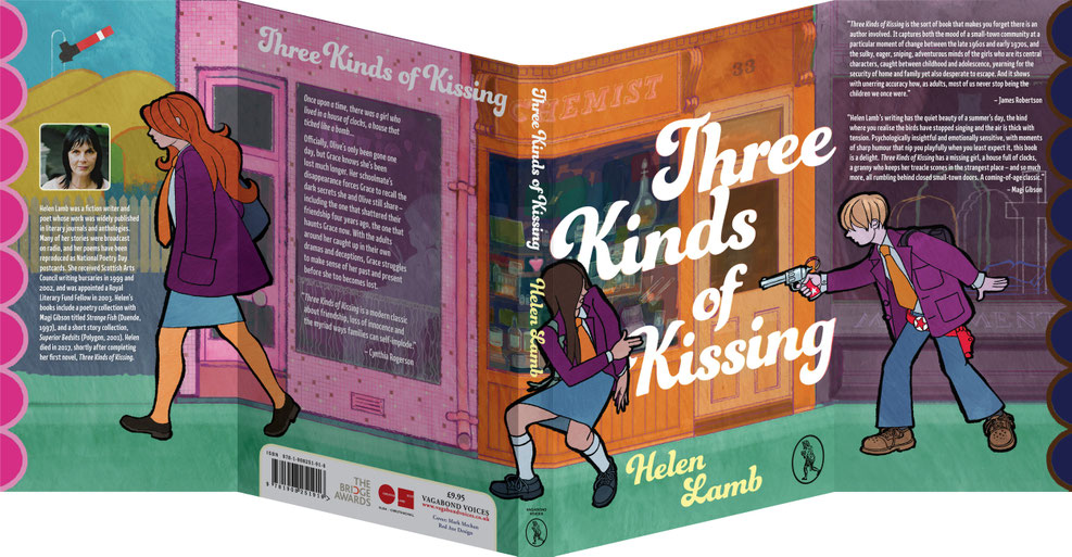
Helen Lamb died in 2017, shortly after completing Three Kinds of Kissing. It was her first novel. Helen's manuscript became the responsibility of her family, and through them – and publisher Vagabond Voices – it has made its way finally into print. Her book initially read to me almost with the flavour of a junior novel – the protagonists are teenagers, the trappings an adult world impinging on young lives – but its subtext is darker, more complex: spliced into this story are strains of alienation, guilt, shame and death. It’s this subtle complexity that inspired me to design one of my more unusual covers: a wrap-around image with key points of the story encoded into it.
There's a small pink heart in the middle of the artwork. It sits above the head of Grace, the narrator, like a thought, or an exclamation.
“We stopped to look in the chemist shop window and waited for him to pass. The loofahs and long handled brushes for scrubbing backs always made us shudder, and we both coveted the Hartnell in Love talcum powder in the pink plastic heart-shaped dispenser. But right then we were more interested in watching for Peter’s reflection.” (Three Kinds of Kissing, p. 141)
I wanted that little heart to be a quiet focus of the design as a whole. It's centred on the spine of the book, which often will be the only portion of that publication that you'll see when it's sitting on a shelf. Grace is there spanning the back cover, spine and front. The hand of Peter (Grace's best friend Olive's little brother), pointing his toy gun, leads in from the front flap; the back cover teases the reader with Olive leading out of frame, on to the back flap.
The idea of a panoramic illustration came to me while I was trying to figure out how to show the dynamic between these three characters. On the face of it the scene I've depicted is almost directly lifted from the pages of the book: when Peter pursues the girls along the street while wearing his cowboy holster, cap gun in hand, peppering them with shots. Grace infuriates Olive by responding to the ever-annoying Peter by suddenly deciding to play along with his game. She playfully returns fire, her fingers in the shape of a gun; it is a sweet and unexpected moment in the narrative. I knew this would be the perfect framework on which I could hang the cover design.
In Springfield Road, he drew his cap gun and took aim.
BANG
“You’re dead.”
Just two words but a lot for him. I whipped around in time to see a puff of smoke rising from the muzzle of his gun, caught a whiff of sulphur. His eyes narrowed to vicious slits and he aimed again. The bang cracked through the air and crows took off from the rooftops squawking and wheeling in the blue sky. I ducked behind the nearest car and fired my imaginary pistol back.
KAPOW
“Don’t encourage him,” Olive said and stormed on ahead.
I pretended I didn’t hear.
BANG
KAPOW
BANG
KAPOW
We kept the gunfire going past the red phone box and on to the railway bridge. Olive was waiting for me at the far end, fuming. “Don’t you know what he’s up to? Whose side are you on?” (Three Kinds of Kissing, pp. 139-40)
Expanding my design across the entire cover, including its front and back inside flaps, enabled me to give more dimension to the story by providing the scope to show the relationship between Grace, Olive and Peter in its troubled form. Here was space to illustrate the separation that would reflect their relationships to each other, but that would also subtly mirror their positions in the narrative: Olive moving on; Peter shadowed by misfortune; Grace caught in between.


Three Kinds of Kissing takes place over two time periods: 1969 and 1973. I'm very deliberately playing up to that era with the style of illustration and the colour palette. Looking at period illustration from that time, I borrowed a discordant scheme: the spectrum of the illustration changes by degrees from sky blue, bubblegum pink and sunshine yellows, to a poppy orange, turquoise, to purples, gloomy navy and browns. From memory my own bookshelf was laden with books featuring that very distinctive style which seemed to span the late ’50s through the ’70s: stylised, heavy, ragged outlined figures, fragmented backdrops in lurid multicolour. The high street I have illustrated here is also a relic of the past. I can remember traipsing round these places with my mum in the early 1970s: chemists, grocers, toyshops, corner shops. Windows crammed with goods, colourful, varied. We can still see traces of that comparatively understated high street in today's more shouty and ever-larger signage. Those mosaic-tiled frontages hidden under layers of paint; tongue-and-groove panelling disappearing beneath sheets of PVC; hand-painted signage occasionally revealed when a shop is refitted.
A deep well of nostalgia exists for those of us who were kids in that time. So Three Kinds of Kissingchimed with me on many levels. Set in unnamed suburban Scotland, I recognised many of the elements that formed the backdrop to the story, as that was my era too. Helen has captured a sense of those very suburban, pre-Internet, sun-drenched summers: boredom in the park, gazing through shop windows; exploring woods and walking embankments. Elsewhere in the novel we read of the moon landing, and shoe-shopping. Saturday jobs and hints of hidden troubles in the lives of the adults in the orbit of the young people at the centre of the book. Everyday elements that shaped a time. The cap gun was a very key element of every ’60s and ’70s kid's toybox: the unspooling roll of spent caps gradually snaking from the top of the pistol, the wonderful, pungent smell of sulphur from exploded caps clinging to the die-cast metal. The toy gun is also something of a signifier of changed times; the way of life from fifty years ago is rapidly becoming obsolete. It was perhaps a less protective, less self-aware society.
I wanted to create a cover that spoke the same language as the novel, and that also reflected the period. I felt I had to draw something colourful but that also carried threat. A design that looked almost as if it were from that time, reminiscent of those junior novels on my shelf, but without becoming a pastiche. Working from memory and referring to photos of the time I drew out the row of shops in pencil line, then transferred my artwork to a digital format to apply colour and texture and to maintain control of the colour palette, which was key. By keeping the background elements tonally restrained, and using no other black but on the figures' heavy, ragged outlines, I gave them prominence. Their facial features I kept largely hidden beneath curtains of hair, with their eyes out of sight. And I photographed my daughter to capture the correct stance for Grace's finger gun toting.
I wanted to create a cover that spoke the same language as the novel, and that also reflected the period. I felt I had to draw something colourful but that also carried threat.
I felt from the early stages that the cover needed a really dominant use of typography. I found a typeface that said late ’60s/early ’70s hopefully without falling on the wrong side of kitsch. I spent a long time prepping the exact proportion and arrangement of the buildings and figures to each other and to the panels of the book. In practical terms I had five panels – two covers, two flaps and the spine. But without knowing the extent of the book in the early stages of its production, a spine width had to be estimated. So I had to keep the design elements flexible.
This is where traditional illustration techniques are eclipsed by modern technology: by drawing the high street separately and by making the children movable, separate elements that could be arranged independently, I left myself some wriggle room. Furthermore, I had to make sure I was leaving myself enough usable space for back cover text and flap text: the blurb, endorsements and author biography. Without having that copy available so early in the project, I asked the publisher if the necessary wordage could be kept as concise as possible (or reasonable) as a favour, to help complement my design. I'm grateful for that level of understanding from the publisher, which gave me the leeway I was hoping for, and I was able to bring my design to a satisfactory finish.
This is what I took from reading Helen's wonderful book: characters' motives and interactions that are largely hidden from view. I hope that I've stayed true to the book's character with this, my cover.
Sun
10
Sep
2017
Designing Doubting Thomas
SEX, DRUGS AND BLASPHEMY IN 17TH CENTURY EDINBURGH
When it comes to creating a new book cover, many ideas are stillborn. In this case though, I found my inspiration quick – and fully formed.
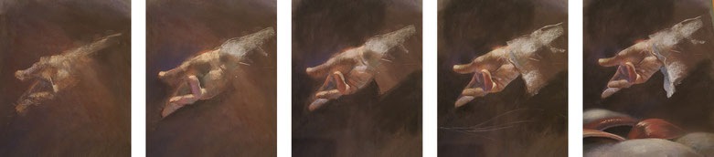
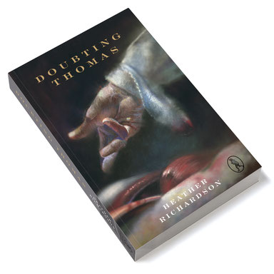
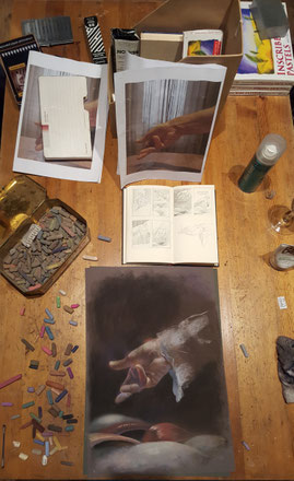
Intimate and invasive, the exploration of a human body by another person (specifically in this case the insertion of fingers) may induce discomfort, pain or nausea; pleasure, embarrassment, or disgust. At the opening of Heather Richardson’s novel Doubting Thomas we are introduced to Dr Carruth, a 17th century Edinburgh surgeon who is about to assist in the autopsy of a heavily pregnant young woman. The subject’s abdomen is opened up but as he slips his hand into the cadaver his fine sleeve is soiled by the dark blood within the body cavity.
It’s almost a throw-away moment of clumsiness – but I saw that blossoming stain as a key moment: representative of everything that follows, and of the moment that his safe notions of religious truth begin to become irreversibly polluted. The effects upon the protagonist in this case are manifold: sexual, political and theological. They resound throughout the novel. That this pivotal moment comes so early in the book is not only structurally interesting but in retrospect is the keystone on which the whole arch of the story rests.
In designing a cover for a novel I’m attempting to distil the essence of the book into perhaps a single image, or at least find a visual that will represent the thing, do it justice. In many cases a front cover image will be needed before the book is even edited. It will often be required in a hurry. Reading a manuscript against the clock is not usually the most beneficial way of finding inspiration, and while many of the Vagabond Voices titles I have worked on have been dense and challenging, in the case of Doubting Thomas I felt no such pressure. Richardson’s prose is tightly written yet it overflows with potent imagery, leaving me with no shortage of material. Written as separate narratives from four different characters, the tale is told in a multifaceted and richly textured way.
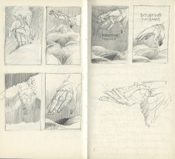
As I’m reading, it’s my habit to scribble in the margins of my print-out as I come across moments that strike me as possibilities for cover ideas. With my designer’s hat on as I make my way through the book, I’m on the lookout for an ‘in’ to help me with the cover. Often, it’ll come gradually or towards the end of the book – a reveal, a twist, or simply an understanding will let something spring to mind. However in the case of Doubting Thomas the very opening scene of the book provides the moment, setting the tone as dark, visceral, intimate and willing to present an unvarnished truth: that what is concealed may be brought forth bloodily, messily but inevitably into the light.
I felt that a dramatically lit hand combined with an undefined fleshy, freshly exposed cavity waiting to be probed, would make for a suitably arresting image.
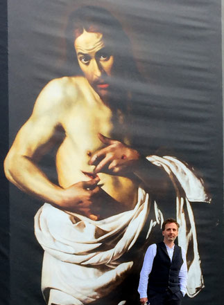
The title ‘Doubting Thomas’ most obviously brings to mind Caravaggio’s masterpiece of realist art: Jesus inviting his sceptical disciple to probe his wound with a finger or two. That painting certainly informed my thoughts as I set about designing the cover. However it was maybe more my intention to seek inspiration from the 17th century Dutch school of art in particular: dark, starkly lit, and concerned with depicting the earnest truth (or maybe it was just those ruffled sleeves on Rembrandt’s subjects that inspired me...) There followed for me then a very long series of thumbnail sketches depicting pretty much the same scene: that of the hand, sleeve and cavity.
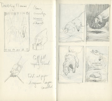
After toying with the idea of revealing more of the cadaver, and from various intimate angles, I settled on a more conservative view of a nevertheless disturbing tableau. Eventually I set up my camera phone in my dining room and snapped my hand in a variety of positions until I found the pose I was looking for. I could use print-outs of my photos to draw from. The next night I rooted in my wife’s wardrobe for a flouncy blouse and pulling it over my right arm, again I took various snaps to guide me as to how the material would hang, and how the light would fall on it.
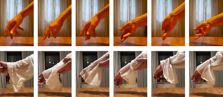
I blew the dust off my trusty tin of soft pastels, and proceeded to work up my drawing over 2 nights and 2 mornings. I had determined to keep this as old school as I could with as little digital footering as possible. Inevitably though I bowed a little to the electronic editing, and introduced a slight strategic blur in some areas of the drawing in order to create focus where I needed it most.
The extension of the artwork onto the spine and back cover was a later addition. Here I am harking back to early medical illustration, using inked line artwork to suggest an ‘engraved’ style. The wide, generously spaced typography came as a result of looking at medical treatises of the time which are fascinating and of course beautifully illustrated. A more authentic view of the past is found on the inside cover with a detail of mid-17th century Grassmarket – another important location in the novel – taken from Cassel’s Old and New Edinburgh.
Mon
18
Jan
2016
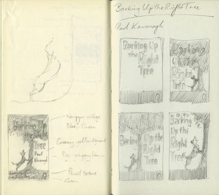
Barking Up the Right Tree
“I sought refuge in words that allowed me to feel connected and began to write my blog — a real ordinary carer, not a part of any party or any political organisation, like a wee ginger dug barking from the sidelines. And I discovered I was not alone. A thousand dugs barked that summer.”
— Paul Kavanagh
The brief for Barking Up The Right Tree — a project that we first called “Wee Ginger Dug” — was as simple as you could hope for: publisher Allan Cameron’s sole instructions were, “If you
have a dog [on the cover], it has to look like his one.” Once the book found its full title, I was off and running.
This book was to be a straightforward collection of political rants/observations. The cover was needed in something of a hurry so this was to be simple. Dog. Barking up a tree.
Having done a few pet portraits in the past I was aware that people are often more attached to their pets than to their spouses or children, and are usually more demanding when it comes to a likeness. The problem with portraits (pets or human) is that the person commissioning doesn’t often grasp that the portrait will only be as good as the photo provided. So my initial problem was not so much the layout of the cover as getting the dog’s look correct.
I had a photo of a wet-nosed wee mongrel looking plaintive, and consequently the sketches I turned out weren’t great. I did sketch after sketch of pretty much the only design I had in my head, and after a number of unsuccessful attempts I requested that Paul provide me with some fresh shots of Ginger (the dug) – and they had to be in profile. This apparently would be awkward as our hero (that’s Ginger, not Paul) was “deeply uncooperative when it comes to photographs”.


Presumably Paul produced a juicy bone with which to bribe dug as a set of excellent photos arrived in my inbox and I could at last try for a decent likeness: shorter and greyer snout, shorter
neck, slightly wider around the middle, ears down, and a few other tweaks. Phew. This one passed muster.
Trying to bring something creative to the design, after having drawn oor dug barking up actual trees in differing colours, and arrangements of typography around them, I felt that perhaps instead
the title itself could form the tree and I set about creating a fun, friendly and lively arrangement suitable for barking up.


Sun
01
Nov
2015
Goldilocks and the Three Nudes
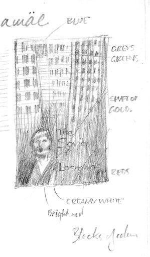
Mari Saat’s The Saviour of Lasnamäe was mentioned to me briefly a few months ago, and Allan Cameron sketched the plot very simply: a working mother falls on hard times and is forced to
turn to prostitution to support her daughter. I doodled in my notebook as a primer for the far-off deadline and the first drawing I turned out — as often happens — was not a million miles from
the final book cover. I saw a fractured pattern of blank windows disappearing into shadow, and a lone human figure — the only splash of colour — in a pool of light at the foot.
Weeks later I received Susan Wilson’s translated manuscript and so was able to read and understand the subtleties in Saat’s story of a girl, her mother, a customer and a grandmother. There was a
wealth of material from which to draw, and all on a very human level. I chose once again to take the route of creating a drawing to use on the cover, as I had previously done with Moon
Country, The Convalescent and Spring Manoeuvres.
I drew upon the experience of my weekly life-drawing club attended in Glasgow, and decided that the vulnerability of the central character Natalya — exposed both metaphorically and literally
throughout the course of the novel — could be best depicted with a charcoal nude. Even as Natalya is exploited in the course of the novel, I wanted to show the female form in a non-exploitative
way without sacrificing the vulnerability of her character. Not really having the facility to hire my own model, I searched Flickr for a reference from which to draw; I found and was given
permission to use what I felt to be the ideal set of photographs: a set of beautiful back-view nudes.
I had it in my head to use the shape of the naked body against the harsh structural lines of the many high-rise flats of the district of Lasnamäe, as a way of depicting the fragility of the
people against the harshness of their surroundings. As an impression of this suburb of Tallinn, the forest of quickly constructed 1970s blocks, with their endless rows of windows and balconies,
provided the perfect contrast to the pale human form.
The final, key element in this cover was to be banknotes. Money infuses the story as the cause and potential cure of the ills that befall the characters. After ensuring that I could reproduce (in
one form or another) the Estonian currency in my artwork, I found the reproduction of the banknotes created a similar grid-like pattern to that of the buildings, but the soft pinks and purples of
the currency lent a more comforting colour scheme to the design. By good chance the image of the swift which appears on the banknote gave a repeat-pattern motif of freedom — a neat counterpoint
to the enclosing rigidity of the high-rise flats.
So, I submitted my completed cover for approval. However, a week or so later I took a call from a rather sheepish Allan Cameron (Vagabond’s publisher) with the feedback that my nude was not quite right: I had clumsily neglected to follow the author’s description of Natalya as “dark and buxom”. My nude was certainly not dark, and she was not overtly buxom. It was suggested that perhaps she also looked on the young side; I had been assured that the model was indeed a middle-aged woman and not a twenty-something.
Nevertheless, the need was for a second version of the cover, with a new drawing: less slim, less fair and perhaps more obviously a typical middle-aged woman. (Which begs the question: what does a typical middle-aged woman look like, anyway? Without wanting to set foot into that particular minefield, I thought it best to stick to the brief — i.e. the novel itself.)
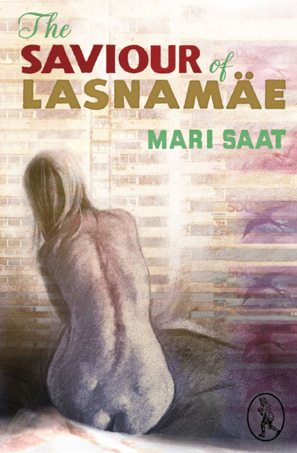

I went back, literally, to the drawing board and attempted to remedy my error. Another cover submitted, another feedback: unfortunately my second charcoal drawing was too far in the opposite direction. Was there this time “a little too much of her?” was the author’s delicately put judgement. And so a week or so on from the second submission, Allan reluctantly asked me to attempt a third nude. I drew again, a nude somewhere in between the first and second. Thankfully this latest submission was deemed “just right”. Ironically, I think the accepted drawing was probably the least strong artistically of my submissions, perhaps because the figure was the least “defined” of the three.

Sat
22
Aug
2015
Moon Country
My initial approach to the cover for Moon Country was to be an entirely hand-drawn cover, in charcoal, with similarly hand-drawn typography overlaid, using a very simple, strong colour palette; however, on showing these early drafts to publisher Allan Cameron it became apparent that this wasn’t quite right for this title. The cover for Moon Country had to be brighter and crazier — more fun.
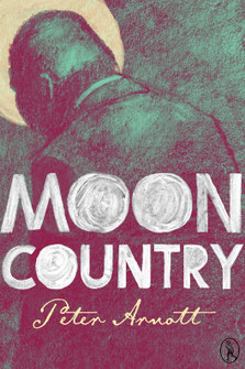
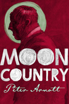
These gloomy-looking drafts were put aside then, and Allan gave me fresh instructions. As briefs go, this was as simple as they come: a Scottish Western (sort of). Allan pictured the classic image of Moon Country’s protagonist, Tommy Hunter, as the lone gunslinger, the man with no name, standing in a street in — if not exactly in the Wild West — then the wild west of Scotland.
I think Wishaw was mentioned.
Being a Hamilton dweller myself and knowing darkest Lanarkshire well, I began to look at the low tenements of the streets of my surrounding towns as a setting for Tommy Hunter. And I began
browsing the gaudy Western pulp novels of the mid-twentieth century as direct inspiration. These were amazingly bold and to-the-point. I quickly saw my new cover in a haze of acid yellow, a
heightened reality; not as a symbol of cowardice, but purely to create an other-worldliness.
Back on the buildings front, I soon realised that I needed a higher structure to create the canyon-like frame for the drawing of Tommy that was waiting to be created. So I began to look closer to
home (well, Vagabond Voices’ home) and I took my camera on to the mean streets of Glasgow’s South Side. I found the perfect street just off Paisley Road West. What I particularly found appealing
was the rash of satellite dishes visible along the walls of this street. These tied in perfectly with my chosen motif of a moon-like circle to be used throughout the artwork. The rows and rows of
red sandstone flats barnacled with these blank, staring circles would be spot on.
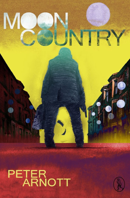
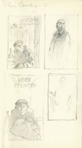
I had planned a mixed media approach for this second draft: photography, another charcoal drawing, and some digital colouring along with a splash of watercolour for texture to create a patchwork
effect: something homespun and slightly off-kilter. Following a few aborted attempts at finding a face for Tommy, I decided it would be more successful to keep the protagonists’ face hidden and
let the dear reader form their own vision of him. And so I drew my gunslinger from behind. Allan had suggested the well-established trope of the view through his legs, down the symmetrical
street, gun cocked, and banknotes fluttering from the bulging carpet bag of loot. It became so pulpy it was almost comic-strip style — and deliberately so.
My first drawing of Tommy was a thick-set, hunched and brooding figure. After consultation with author Peter Arnott however, the advice was that he looked too “simian”, and that he should appear
more upright and wiry. So with a little digital slimming and bodywork, I presented an altered version of Tommy. He was promptly given a thumbs up.
I thoroughly enjoyed ramping up the saturation in the colour palette of this cover. I wanted violent yellows rubbing up against emerald greens and rosy reds; the repetition of the windows of the
flats flecked with the white discs of the dishes; and the poetic swirl of carpet bag pattern as a little dark island of prettiness in amongst the splashes of clashing colour.
The typography here was to feature an extension of the circular moon motif, and it allowed me to stack the three letters “O” close together to form this further array of solid circles — alongside
the moon itself floating lilac in that sea of sickly yellow.
Sat
27
Jun
2015
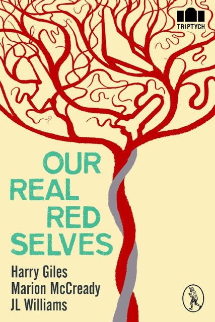
Our Real Red Selves
The brief for Our Real Red Selves was simple: war and birth. Three poets taken together and linked with a very human condition: we are born with a natural propensity to violence.
Poetry is a tricky thing to get across in an illustration. It’s not something that suits a literal approach, even if something literal is to be found amongst the words. But having an overarching
concept to the collection made life easier. The question was, how do I come by a cover that sums up this theme?
The thorny subject du jour of mechanised, unmanned warfare is symbolised in the terrifying shape of the eyeless carapace of the drone. War motifs are ten-a-penny, and when it comes to
finding a symbol covering both creation of new life and the destructiveness of war it’s hard to avoid finding fertile ground (pun intended). No shortage of phallic symbols in the machismo of
missiles and gun barrels...


But I needed subtle thoughts and not crass visual puns. So, gentler thoughts of birth, and the protection of the womb, the safety of being enclosed and unaware of what lies in wait, led me to look at the human placenta and its amazing and beautiful network of vessels. With the double-twist of the umbilical cord it forms an almost tree-like structure of filigree tendrils — and it came to me that I could use that structure to show, to the keen-eyed, that there is a tendency to war hidden in even our origins.
There is a recent trend in an area such as logo design for objects hidden within areas of negative space in an illustration. A case in point might be the well-known FedEx logo with its arrow hidden within the typography, telling us of direction, delivery and dynamism. Often these symbols remain unnoticed, but they are there, subliminally, reinforcing the message the designer needs to get across. My lightbulb moment came while studying the structure of the placenta and finding numerous possibilities for hiding symbols of war within its “branches”. Here was where I could hide my cluster bomb, my pistol and my stealth bomber.
Working purely digitally and armed with silhouettes of three war machines, I drew around the shapes and spun the vessels of the placenta to hide or reveal the weaponry. The result is simple but
direct, and hopefully effective.
And the colour scheme? Of course, it had to be red.
Wed
13
May
2015
Illustrating for Aliyyah
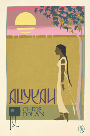
“I’m very excited about this one!” was publisher Allan Cameron’s mantra throughout this project.
Unusual for me in that it was not just a cover job, this was a commission for ten (nine, as it turned out) full-page illustrations. Aliyyah is Chris Dolan’s follow-up to Potter’s Field, his Glasgow-based contemporary crime novel, and it marked a characteristic change of tone and direction for him. Basing his story loosely upon one by Robert Louis Stevenson, Chris described Aliyyah to me as a fable of sorts, or a modern addition to Tales from the Thousand and One Nights in scope and setting, with touches of Eastern mystery, Western technology and Shakespeare’s Queen Mab making an appearance. Something simultaneously timeless and contemporary was what he was aiming for, with an unspecified setting, in an undefined time period, peopled by characters with clouded backgrounds.
If that sounds a little vague, it was fitting. My understanding of the story was to be built up only gradually as the text was fed to me in sections practically as they were ripped from the typewriter. I designed the cover without having read the full manuscript, but I had enough knowledge of the story to complete that first important stage. Allan needed the front for advance publicity and thankfully my approach of a very linear, almost Art Nouveau style was met with approval. The author had a notion that this little book would be a one-off “special”, perhaps designed to look like an old, found object, without even a author’s name on the cover. Although that didn’t quite come to fruition, I had the idea that the title — this unfamiliar word, “Aliyyah” — should become part of the pattern, an element of the overall design. Because it was not a particularly recognisable word anyway, I felt I could afford to make it almost suggestive of Arabic script, and more decorative than legible.
I decided I had to wait until the text was completed before I could make an informed decision on which were the key scenes I should illustrate. During our correspondence Chris supplied me with a list of suggestions which happily tallied almost exactly with my own choices. Publisher and author waited patiently for my first batch of pencils, which I had promised several times but which proved, ah, reluctant to make their appearance. When they finally did, they were met with great enthusiasm, much to my relief. The guidance I had received was that these should be reminiscent of the Victorian style of book illustration: full page, bound in a simple hand-drawn line frame, and with a legend beneath drawn from the body of the text. While it is one thing to draw inspiration from the greats such as Rackham, Goble and Beardsley, it was quite another to get down on paper the images I saw in my head, and to produce work of any kind of quality. I wanted to create something stylised and elegant, using negative space and line pattern to create balance. And I had to do justice to the quality author’s jewel-like tale.

Happily, both Chris and Allan are generous in their advice and appreciative of the artist’s role. In fact, they trusted me to do pretty much whatever I thought worked — which is music to the ears of the illustrator, but perhaps risky unless you are familiar with his or her body of work.
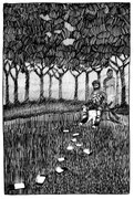
Having read the text I began to sketch thumbnails in my diary at a very small scale — an inch or two — to see what might work. Moving up in scale for the final pieces I tried to bring them all along concurrently to maintain consistency; however, my memory was letting me down at this stage — For example, when I drew the scene in which Haldane experiences what he takes to be a vision of Aliyyah floating in the dark evening sky. I had the notion that he was walking through the orchard, and so drew the brightly lit young woman partially obscured by a lattice of branches. In fact there were no trees in this scene, and I had concocted them entirely. I quite liked the way they looked, and was disappointed to discover they would have to be chopped down. Chris, however, didn’t object even after I pointed this out, and so the trees remain in the final illustration.
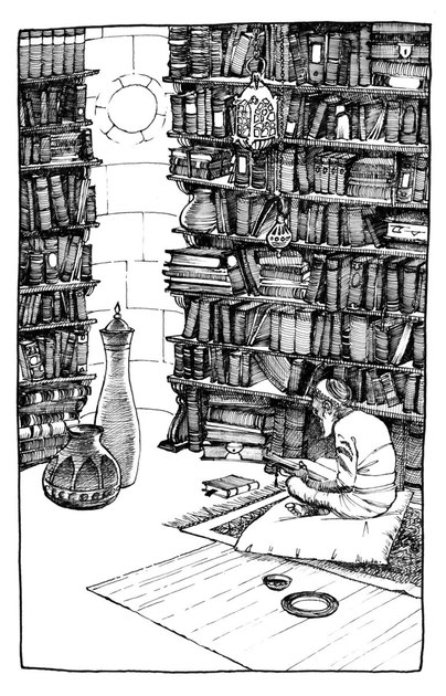
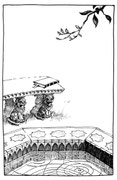
The balance of tone throughout the batch veers between clean, white empty spaces — whitewashed interiors, sunlit fountains — and dark, dense texture and movement: night woods, library shelves creaking with leather-bound volumes, swirling smoke and curling drapery. Throughout cover, illustrations and text drop caps I threaded a recurrent motif in the form of the damaged radio from the crashed helicopter that has been salvaged and becomes the soldier Haldane’s only chance to bridge the gap between his enforced, enclosed recuperation and the army life and colleagues which remain elusive in his memory and throughout the tale itself. Its form of a dark, square box, with circular detail and tentacle-like cables was a counterpoint to the more natural forms of the fig trees, flowers and rippling water of the gardens surrounding his rescuer Duban’s house in the idyllic enclosure.
I can admit to a minor lack of satisfaction in my final submissions, in that despite trying to work them up to a finish simultaneously, my style wavered from drawing to drawing just a little too much. The earlier illustrations show a more regimented, laboured line style (such as the white bedroom) as opposed to the looser, more free line evident in the latter drawings such as the homecoming. On a more technical note, I drew these on my favoured tissue-like layout paper which develops a pleasing, crinkly quality as it is worked upon. However, in retrospect a more stable surface might have given me a cleaner line. Furthermore I should probably have worked on a slightly larger scale to allow more control in my line work. These drawing are reduced only to 90 or 80 per cent on the page. Lesson learned for the next time, perhaps…
Maybe these are quibbles only the illustrator could raise; on the whole I’m satisfied with the result. More importantly, Chris Dolan is enthusiastic in his appreciation — and happy to have them alongside his story.
This blog first appeared on Vagabond Voices.co.uk
Wed
25
Mar
2015
Spring Manoeuvres

Often when I’m given a manuscript to read for a new cover, I’ll be reading it piecemeal on my phone screen, or if I can, printed out onto A4 sheets to be looked over on the daily commute into
Glasgow — in the mornings when I’m feeling at my sharpest, or in the evening when I’m mostly battling against my drooping eyelids. This was the case with Peter Gilmour’s Spring
Manoeuvres. But where I would usually make copious notes in my pocketbook as I made my way through the text — jotting thoughts or reminders of points in the text that struck me as useful for
a cover — with Peter’s novel this time I hit on a single idea fairly early on, which I couldn’t really get by as I read on through the rest of the book:
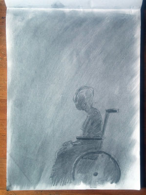
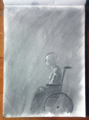
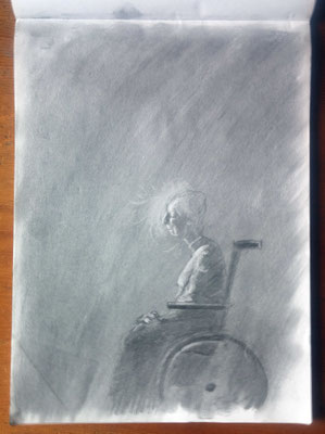
A central character, Edith, is elderly and wheelchair-bound physically, but inwardly she is fiercely independent. She keeps a journal into which we, the readers, are allowed to pry at various
stages throughout the text. I made one quick note in my diary in the middle of a busy train — a quote from Edith: “... true protest is solitary, hatched in darkness but then shedding light”. That
became the central motif for my cover.
Edith’s meditations were a key element in the story for me: the inner space that she created for herself made me think of the submarines, the loch, and the secrecy surrounding the other
characters. I had the slightly off-the-wall image of Edith surrounded by the dark, peaty waters of the loch — or put another way, in the depths of an interior world — with her white hair floating
around; the hint of a malevolent submarine and the shafts of light reflecting off the rim of the wheelchair — a bit like the scales of a fish glimpsed in the water.
When it came to producing the artwork, I chose to first physically draw the image then bring it into Photoshop for enhancing. I drew in charcoal on A4 layout paper, which is a very thin,
semi-opaque and smooth surface. Normally I would guard against using a paper such as this for a charcoal drawing, as layout paper lacks any “tooth”, but in this case it was the smooth quality I
was after. I laid down an even mid-tone, then working rapidly I sketched out the form of Edith and picked out the highlights using a particularly sticky putty rubber. I had a quick google on my
phone to check the structure of a typical wheelchair, but no more than a glance. I was not interested here in detail, only form.

I laid down an even mid-tone, then working rapidly I sketched out the form of Edith and picked out the highlights using a particularly sticky putty rubber.
The danger with knowing that the drawing you are working on is going to end up in Photoshop (and therefore be “fixable” should you make any glaring mistakes) is that you can depend too much on
sorting things “in post”: in order to avoid losing the immediacy of the original drawing when it comes to working on it digitally, I try to get things right the first time.
With the drawing complete (and without a working scanner at home) I photographed the page by the window using a digital SLR and then opened the file in Photoshop, working with a Wacom tablet and
stylus. The challenge at this point was to get across the notion of the dreamlike quality of this underwater world without making it appear that this was just a picture of a drowned woman in a
wheelchair. It took long experimentation with combinations of colour and tone in transparent layers of blues and peaty browns to achieve a finish I was happy with. I then pulled back a little and
again picked out highlights, choosing the floating hair as a bright focal point and introducing shafts of greenish light coming from above. I was reluctant to introduce the dim silhouette of the
submarine, but my worry was that the illustration was not really saying “underwater” enough, so without resorting to bubbles or fish drifting by, I brought in the sub, which after all features
heavily throughout the book.
At this late stage and looking at the whole thing with fresh eyes, I could see that I had made Edith’s neck too long. (I take back what I said earlier — thank heavens for Photoshop.) Hopefully,
then, the right balance is struck between ambiguity and clarity. Initial reactions to the finished cover have been to fail to recognise — at first — the watery trappings of the scene. So I may
yet have to revisit that sub and exaggerate it a little more. As for the typography, I felt that it had to be quiet and restrained, the colours again suggesting the silvery glints seen through
peat-stained water. And finally, I misspell “manoeuvres” almost every time I write it out. I hope I have it correct on this cover.
