


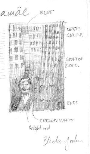
Mari Saat’s The Saviour of Lasnamäe was mentioned to me briefly a few months ago, and Allan Cameron sketched the plot very simply: a working mother falls on hard times and is forced to
turn to prostitution to support her daughter. I doodled in my notebook as a primer for the far-off deadline and the first drawing I turned out — as often happens — was not a million miles from
the final book cover. I saw a fractured pattern of blank windows disappearing into shadow, and a lone human figure — the only splash of colour — in a pool of light at the foot.
Weeks later I received Susan Wilson’s translated manuscript and so was able to read and understand the subtleties in Saat’s story of a girl, her mother, a customer and a grandmother. There was a
wealth of material from which to draw, and all on a very human level. I chose once again to take the route of creating a drawing to use on the cover, as I had previously done with Moon
Country, The Convalescent and Spring Manoeuvres.
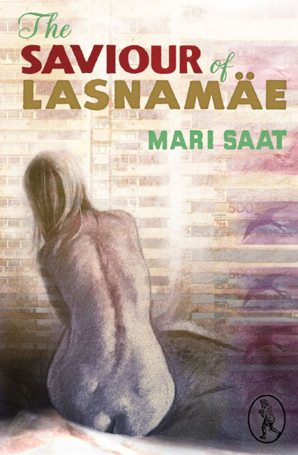
I drew upon the experience of my weekly life-drawing club attended in Glasgow, and decided that the vulnerability of the central character Natalya — exposed both metaphorically and literally
throughout the course of the novel — could be best depicted with a charcoal nude. Even as Natalya is exploited in the course of the novel, I wanted to show the female form in a non-exploitative
way without sacrificing the vulnerability of her character. Not really having the facility to hire my own model, I searched Flickr for a reference from which to draw; I found and was given
permission to use what I felt to be the ideal set of photographs: a set of beautiful back-view nudes.
I had it in my head to use the shape of the naked body against the harsh structural lines of the many high-rise flats of the district of Lasnamäe, as a way of depicting the fragility of the
people against the harshness of their surroundings. As an impression of this suburb of Tallinn, the forest of quickly constructed 1970s blocks, with their endless rows of windows and balconies,
provided the perfect contrast to the pale human form.
The final, key element in this cover was to be banknotes. Money infuses the story as the cause and potential cure of the ills that befall the characters. After ensuring that I could reproduce (in
one form or another) the Estonian currency in my artwork, I found the reproduction of the banknotes created a similar grid-like pattern to that of the buildings, but the soft pinks and purples of
the currency lent a more comforting colour scheme to the design. By good chance the image of the swift which appears on the banknote gave a repeat-pattern motif of freedom — a neat counterpoint
to the enclosing rigidity of the high-rise flats.
So, I submitted my completed cover for approval. However, a week or so later I took a call from a rather sheepish Allan Cameron (Vagabond’s publisher) with the feedback that my nude was not quite right: I had clumsily neglected to follow the author’s description of Natalya as “dark and buxom”. My nude was certainly not dark, and she was not overtly buxom. It was suggested that perhaps she also looked on the young side; I had been assured that the model was indeed a middle-aged woman and not a twenty-something.
Nevertheless, the need was for a second version of the cover, with a new drawing: less slim, less fair and perhaps more obviously a typical middle-aged woman. (Which begs the question: what does a typical middle-aged woman look like, anyway? Without wanting to set foot into that particular minefield, I thought it best to stick to the brief — i.e. the novel itself.)

I went back, literally, to the drawing board and attempted to remedy my error. Another cover submitted, another feedback: unfortunately my second charcoal drawing was too far in the opposite direction. Was there this time “a little too much of her?” was the author’s delicately put judgement. And so a week or so on from the second submission, Allan reluctantly asked me to attempt a third nude. I drew again, a nude somewhere in between the first and second. Thankfully this latest submission was deemed “just right”. Ironically, I think the accepted drawing was probably the least strong artistically of my submissions, perhaps because the figure was the least “defined” of the three.

Write a comment