


Often when I’m given a manuscript to read for a new cover, I’ll be reading it piecemeal on my phone screen, or if I can, printed out onto A4 sheets to be looked over on the daily commute into
Glasgow — in the mornings when I’m feeling at my sharpest, or in the evening when I’m mostly battling against my drooping eyelids. This was the case with Peter Gilmour’s Spring
Manoeuvres. But where I would usually make copious notes in my pocketbook as I made my way through the text — jotting thoughts or reminders of points in the text that struck me as useful for
a cover — with Peter’s novel this time I hit on a single idea fairly early on, which I couldn’t really get by as I read on through the rest of the book:
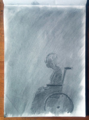
A central character, Edith, is elderly and wheelchair-bound physically, but inwardly she is fiercely independent. She keeps a journal into which we, the readers, are allowed to pry at various
stages throughout the text. I made one quick note in my diary in the middle of a busy train — a quote from Edith: “... true protest is solitary, hatched in darkness but then shedding light”. That
became the central motif for my cover.
Edith’s meditations were a key element in the story for me: the inner space that she created for herself made me think of the submarines, the loch, and the secrecy surrounding the other
characters. I had the slightly off-the-wall image of Edith surrounded by the dark, peaty waters of the loch — or put another way, in the depths of an interior world — with her white hair floating
around; the hint of a malevolent submarine and the shafts of light reflecting off the rim of the wheelchair — a bit like the scales of a fish glimpsed in the water.
When it came to producing the artwork, I chose to first physically draw the image then bring it into Photoshop for enhancing. I drew in charcoal on A4 layout paper, which is a very thin,
semi-opaque and smooth surface. Normally I would guard against using a paper such as this for a charcoal drawing, as layout paper lacks any “tooth”, but in this case it was the smooth quality I
was after. I laid down an even mid-tone, then working rapidly I sketched out the form of Edith and picked out the highlights using a particularly sticky putty rubber. I had a quick google on my
phone to check the structure of a typical wheelchair, but no more than a glance. I was not interested here in detail, only form.

I laid down an even mid-tone, then working rapidly I sketched out the form of Edith and picked out the highlights using a particularly sticky putty rubber.
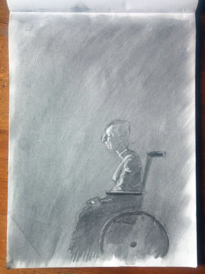
The danger with knowing that the drawing you are working on is going to end up in Photoshop (and therefore be “fixable” should you make any glaring mistakes) is that you can depend too much on
sorting things “in post”: in order to avoid losing the immediacy of the original drawing when it comes to working on it digitally, I try to get things right the first time.
With the drawing complete (and without a working scanner at home) I photographed the page by the window using a digital SLR and then opened the file in Photoshop, working with a Wacom tablet and
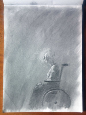
stylus. The challenge at this point was to get across the notion of the dreamlike quality of this underwater world without making it appear that this was just a picture of a drowned woman in a
wheelchair. It took long experimentation with combinations of colour and tone in transparent layers of blues and peaty browns to achieve a finish I was happy with. I then pulled back a little and
again picked out highlights, choosing the floating hair as a bright focal point and introducing shafts of greenish light coming from above. I was reluctant to introduce the dim silhouette of the
submarine, but my worry was that the illustration was not really saying “underwater” enough, so without resorting to bubbles or fish drifting by, I brought in the sub, which after all features
heavily throughout the book.
At this late stage and looking at the whole thing with fresh eyes, I could see that I had made Edith’s neck too long. (I take back what I said earlier — thank heavens for Photoshop.) Hopefully,
then, the right balance is struck between ambiguity and clarity. Initial reactions to the finished cover have been to fail to recognise — at first — the watery trappings of the scene. So I may
yet have to revisit that sub and exaggerate it a little more. As for the typography, I felt that it had to be quiet and restrained, the colours again suggesting the silvery glints seen through
peat-stained water. And finally, I misspell “manoeuvres” almost every time I write it out. I hope I have it correct on this cover.

Write a comment