


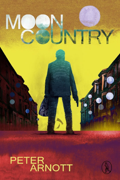
My initial approach to the cover for Moon Country was to be an entirely hand-drawn cover, in charcoal, with similarly hand-drawn typography overlaid, using a very simple, strong colour palette; however, on showing these early drafts to publisher Allan Cameron it became apparent that this wasn’t quite right for this title. The cover for Moon Country had to be brighter and crazier — more fun.
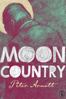
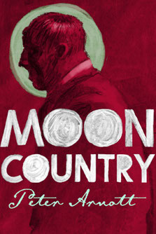
These gloomy-looking drafts were put aside then, and Allan gave me fresh instructions. As briefs go, this was as simple as they come: a Scottish Western (sort of). Allan pictured the classic image of Moon Country’s protagonist, Tommy Hunter, as the lone gunslinger, the man with no name, standing in a street in — if not exactly in the Wild West — then the wild west of Scotland.
I think Wishaw was mentioned.
Being a Hamilton dweller myself and knowing darkest Lanarkshire well, I began to look at the low tenements of the streets of my surrounding towns as a setting for Tommy Hunter. And I began
browsing the gaudy Western pulp novels of the mid-twentieth century as direct inspiration. These were amazingly bold and to-the-point. I quickly saw my new cover in a haze of acid yellow, a
heightened reality; not as a symbol of cowardice, but purely to create an other-worldliness.
Back on the buildings front, I soon realised that I needed a higher structure to create the canyon-like frame for the drawing of Tommy that was waiting to be created. So I began to look closer to
home (well, Vagabond Voices’ home) and I took my camera on to the mean streets of Glasgow’s South Side. I found the perfect street just off Paisley Road West. What I particularly found appealing
was the rash of satellite dishes visible along the walls of this street. These tied in perfectly with my chosen motif of a moon-like circle to be used throughout the artwork. The rows and rows of
red sandstone flats barnacled with these blank, staring circles would be spot on.
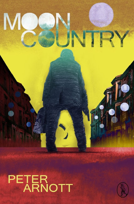
I had planned a mixed media approach for this second draft: photography, another charcoal drawing, and some digital colouring along with a splash of watercolour for texture to create a patchwork
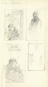
effect: something homespun and slightly off-kilter. Following a few aborted attempts at finding a face for Tommy, I decided it would be more successful to keep the protagonists’ face hidden and
let the dear reader form their own vision of him. And so I drew my gunslinger from behind. Allan had suggested the well-established trope of the view through his legs, down the symmetrical
street, gun cocked, and banknotes fluttering from the bulging carpet bag of loot. It became so pulpy it was almost comic-strip style — and deliberately so.
My first drawing of Tommy was a thick-set, hunched and brooding figure. After consultation with author Peter Arnott however, the advice was that he looked too “simian”, and that he should appear
more upright and wiry. So with a little digital slimming and bodywork, I presented an altered version of Tommy. He was promptly given a thumbs up.
I thoroughly enjoyed ramping up the saturation in the colour palette of this cover. I wanted violent yellows rubbing up against emerald greens and rosy reds; the repetition of the windows of the
flats flecked with the white discs of the dishes; and the poetic swirl of carpet bag pattern as a little dark island of prettiness in amongst the splashes of clashing colour.
The typography here was to feature an extension of the circular moon motif, and it allowed me to stack the three letters “O” close together to form this further array of solid circles — alongside
the moon itself floating lilac in that sea of sickly yellow.
Write a comment