
SEX, DRUGS AND BLASPHEMY IN 17TH CENTURY EDINBURGH
When it comes to creating a new book cover, many ideas are stillborn. In this case though, I found my inspiration quick – and fully formed.
Intimate and invasive, the exploration of a human body by another person (specifically in this case the insertion of fingers) may induce discomfort, pain or nausea; pleasure, embarrassment, or disgust. At the opening of Heather Richardson’s novel Doubting Thomas we are introduced to Dr Carruth, a 17th century Edinburgh surgeon who is about to assist in the autopsy of a heavily pregnant young woman. The subject’s abdomen is opened up but as he slips his hand into the cadaver his fine sleeve is soiled by the dark blood within the body cavity.
It’s almost a throw-away moment of clumsiness – but I saw that blossoming stain as a key moment: representative of everything that follows, and of the moment that his safe notions of religious truth begin to become irreversibly polluted. The effects upon the protagonist in this case are manifold: sexual, political and theological. They resound throughout the novel. That this pivotal moment comes so early in the book is not only structurally interesting but in retrospect is the keystone on which the whole arch of the story rests.
In designing a cover for a novel I’m attempting to distil the essence of the book into perhaps a single image, or at least find a visual that will represent the thing, do it justice. In many cases a front cover image will be needed before the book is even edited. It will often be required in a hurry. Reading a manuscript against the clock is not usually the most beneficial way of finding inspiration, and while many of the Vagabond Voices titles I have worked on have been dense and challenging, in the case of Doubting Thomas I felt no such pressure. Richardson’s prose is tightly written yet it overflows with potent imagery, leaving me with no shortage of material. Written as separate narratives from four different characters, the tale is told in a multifaceted and richly textured way.
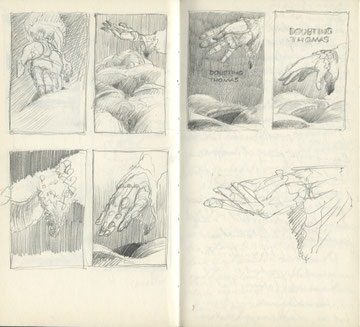
As I’m reading, it’s my habit to scribble in the margins of my print-out as I come across moments that strike me as possibilities for cover ideas. With my designer’s hat on as I make my way through the book, I’m on the lookout for an ‘in’ to help me with the cover. Often, it’ll come gradually or towards the end of the book – a reveal, a twist, or simply an understanding will let something spring to mind. However in the case of Doubting Thomas the very opening scene of the book provides the moment, setting the tone as dark, visceral, intimate and willing to present an unvarnished truth: that what is concealed may be brought forth bloodily, messily but inevitably into the light.
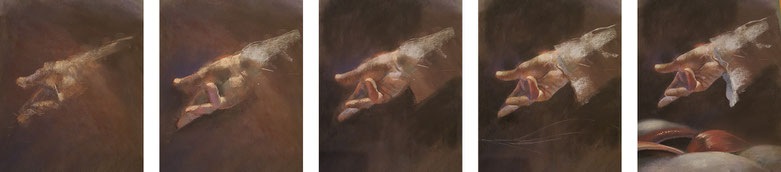
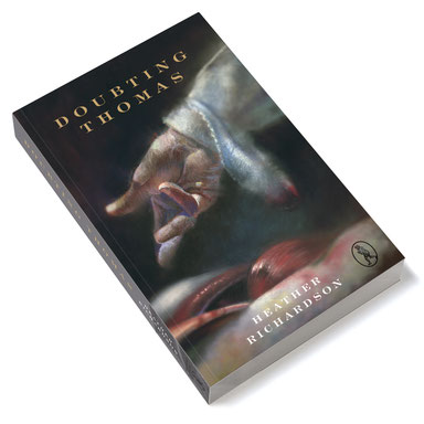
I felt that a dramatically lit hand combined with an undefined fleshy, freshly exposed cavity waiting to be probed, would make for a suitably arresting image.
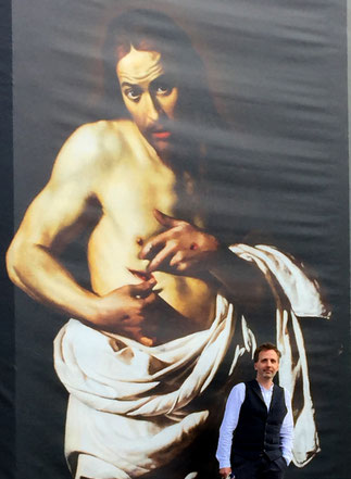
The title ‘Doubting Thomas’ most obviously brings to mind Caravaggio’s masterpiece of realist art: Jesus inviting his sceptical disciple to probe his wound with a finger or two. That painting certainly informed my thoughts as I set about designing the cover. However it was maybe more my intention to seek inspiration from the 17th century Dutch school of art in particular: dark, starkly lit, and concerned with depicting the earnest truth (or maybe it was just those ruffled sleeves on Rembrandt’s subjects that inspired me...) There followed for me then a very long series of thumbnail sketches depicting pretty much the same scene: that of the hand, sleeve and cavity.
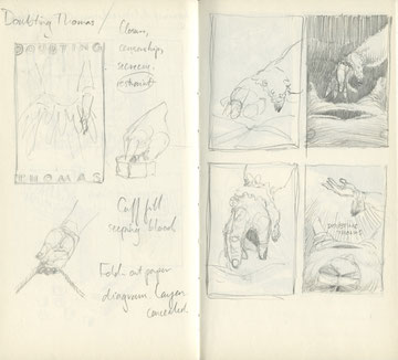
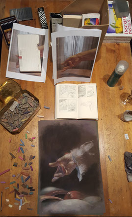
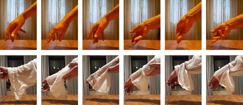
After toying with the idea of revealing more of the cadaver, and from various intimate angles, I settled on a more conservative view of a nevertheless disturbing tableau. Eventually I set up my camera phone in my dining room and snapped my hand in a variety of positions until I found the pose I was looking for. I could use print-outs of my photos to draw from. The next night I rooted in my wife’s wardrobe for a flouncy blouse and pulling it over my right arm, again I took various snaps to guide me as to how the material would hang, and how the light would fall on it.
I blew the dust off my trusty tin of soft pastels, and proceeded to work up my drawing over 2 nights and 2 mornings. I had determined to keep this as old school as I could with as little digital footering as possible. Inevitably though I bowed a little to the electronic editing, and introduced a slight strategic blur in some areas of the drawing in order to create focus where I needed it most.
The extension of the artwork onto the spine and back cover was a later addition. Here I am harking back to early medical illustration, using inked line artwork to suggest an ‘engraved’ style. The wide, generously spaced typography came as a result of looking at medical treatises of the time which are fascinating and of course beautifully illustrated. A more authentic view of the past is found on the inside cover with a detail of mid-17th century Grassmarket – another important location in the novel – taken from Cassel’s Old and New Edinburgh.